7 Color Palettes for a Minimalist Wardrobe
- Nov 1, 2025
- 3 min read

A minimalist wardrobe isn’t just about owning fewer clothes — it’s about choosing colors that blend effortlessly and make getting dressed simple. Whether you lean toward warm neutrals or cool, modern tones, the right color palette brings harmony and versatility to your closet.
Below, you’ll find seven curated color combinations inspired by the quiet luxury aesthetic — timeless, elevated, and easy to mix and match.
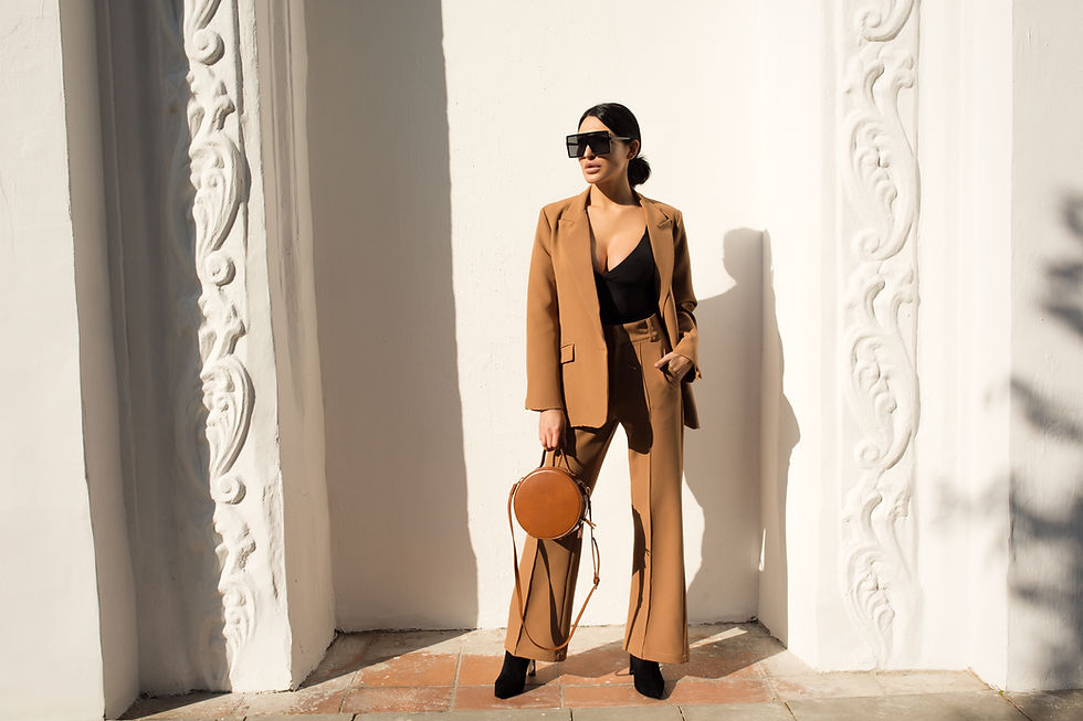
1.The Classic Neutral Palette: Ivory, Camel, Espresso, Black, and Taupe

This palette forms the backbone of every minimalist closet. Think creamy sweaters, camel trousers, and espresso coats anchored by black accessories. These tones transition seamlessly from season to season and can be dressed up or down.
Best for: Classic dressers who love timeless pieces and quiet luxury.
2.The Cool Monochrome Palette: Charcoal, Dove Gray, Stone, White, and Ink

Understated yet powerful, this palette evokes a modern, architectural feel. Layer soft grays with crisp whites and deep navy for a sophisticated, urban look.
Style tip: Mix matte and shiny textures (like wool and silk) to keep it from feeling flat.
3. The Warm Earth Palette: Terracotta, Mocha, Sand, Olive, and Cream

Inspired by nature, this palette brings warmth and depth to your minimalist wardrobe. Perfect for fall or anyone who gravitates toward cozy, grounded tones.
Pair with: Gold jewelry and natural fabrics like linen or cashmere.
4.The Parisian Palette: Black, Ecru, Beige, Chocolate, and Soft Blush

This palette is the secret behind that effortless French-girl aesthetic. A balance of structure and softness — perfect for chic neutrals with a hint of romance.
Outfit idea: A beige trench, black loafers, and a soft blush silk blouse.
5. The Modern Minimalist Palette: Ivory, Slate, Oat, Charcoal, and Bone

If your aesthetic leans clean and contemporary, this palette is for you. These subtle neutrals create an elevated, almost gallery-like look that feels both relaxed and intentional.
Best for: Lovers of Scandinavian interiors and sleek silhouettes.
6.The Espresso Luxe Palette: Deep Brown, Ivory, Caramel, Truffle, and Gold
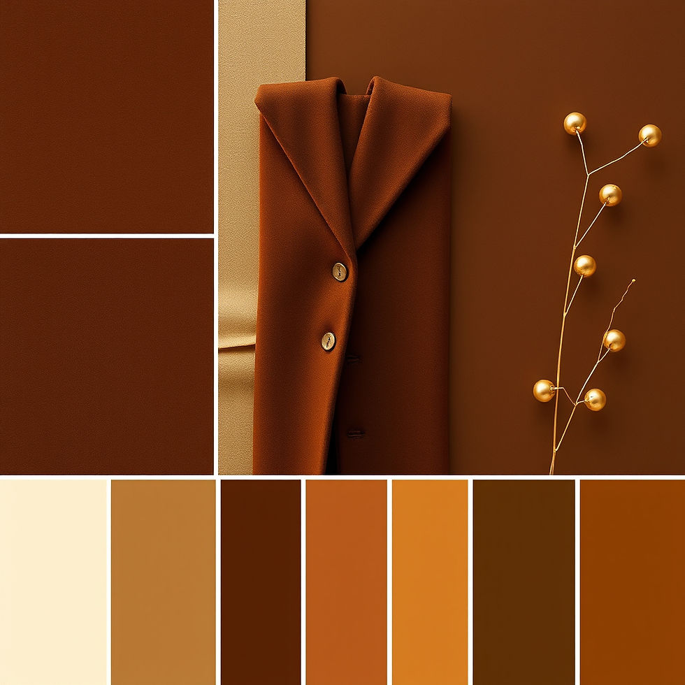
Warm, rich, and quietly luxurious. This palette blends depth and light for a more elegant take on minimalism. It’s a favorite among those who prefer depth without drama.
Pair with: Leather accessories, gold accents, and wool textures.
7.The Soft Neutral Palette: Mushroom, Cream, Pebble, Latte, and Warm White

Soft and soothing, this palette is ideal for creating calm, elevated everyday looks. It complements all skin tones and works year-round.
Style tip: Stick to tonal dressing for an effortlessly expensive look.
How to Build Your Capsule Around Your Minimalist Color Palette
Pick your base tones (2–3 colors you wear most).
Add secondary tones (complementary neutrals that mix easily).
Use accents sparingly (like blush, olive, or gold).
Keep textures varied (linen, wool, leather) to add visual interest.
Choosing a cohesive minimalist color palette makes your wardrobe feel intentional — every piece pairs effortlessly, and every outfit feels elevated.
Bringing It All Together: From Palette to Capsule
Once you’ve chosen your tones, it’s time to bring them to life with intentional pieces and brands that reflect your personal style.
Start by applying your chosen palette to the 10 timeless staples outlined in [Fall Capsule Wardrobe 2025: 10 Pieces, Endless Outfits]. You’ll see how neutrals like camel, ivory, and espresso mix effortlessly to create endless combinations that feel cohesive and elevated.
Then, explore [10 Affordable Brands for a Chic Capsule Wardrobe] to find budget-friendly, quiet luxury pieces that align with your palette. From Mango’s tailored coats to Sézane’s knits, these brands make minimalist dressing attainable — and beautiful.
By uniting your palette, your pieces, and your brands, you’re creating more than outfits — you’re crafting a wardrobe that feels calm, intentional, and timeless.
“Style isn’t about having more; it’s about choosing better.”

cổng game hitclub mình vừa lướt thử cho biết vì thấy mấy đứa bạn hay nhắc, kiểu vào xem giao diện ra sao thôi. Ấn tượng đầu là trang nhìn khá sạch, các mục chia theo nhóm nên tìm cái mình cần cũng nhanh, không bị rối mắt. Mình có để ý họ có nhắc chứng chỉ bảo mật GEOTRUST ở phần giới thiệu, đọc lướt qua thấy cũng yên tâm hơn chút khi ngó nghiêng. Trên web thì kéo xuống mượt, chữ to vừa phải, nền và icon nhìn dễ chịu chứ không chói. Mấy khối nội dung xếp thẳng hàng, khoảng cách ổn, nhìn là biết họ cố làm cho người mới khỏi phải mò lâu. Thanh menu…
https://keonhacai.cam/ mình vào thử cho biết vì thấy bạn bè nhắc, kiểu lướt nhanh xem giao diện ra sao thôi. Ấn tượng đầu là trang nhìn khá thoáng, không bị nhồi chữ nên đỡ mệt mắt. Mình thích cách họ chia nội dung thành từng khối rõ ràng, kéo xuống là hiểu ngay đang ở phần nào chứ không phải đoán. Mấy bảng thông tin trình bày theo cột ngay ngắn, liếc qua vẫn bắt kịp ý chính, không bị rối như nhiều chỗ khác. Menu cũng đặt dễ thấy nên bấm qua lại khá mượt, không phải tìm mãi. Nói chung dùng vài phút là quen tay vì các khối nội dung và bảng cột được căn chỉnh gọn…
rophim hôm trước mình thấy mấy đứa bạn share nên tò mò vào xem thử cho biết. Mình không kiểu săn phim “đỉnh” hay gì, chủ yếu xem trải nghiệm có dễ chịu không thôi. Vào trang cái là thấy nội dung hiện ra khá nhanh, không bị mấy lớp hiệu ứng che màn hình hay bắt chờ lâu. Lướt một vòng thấy bố cục gọn, các khối phim xếp nhìn dễ hiểu nên tìm thể loại cũng đỡ mất công. Mình thử mở trên điện thoại nữa, kéo xuống rồi chuyển mục vẫn mượt, không bị giật lag khó chịu. Có cái mình để ý là họ có ghi kiểu phim HD 4K nên nhìn phát biết chất lượng…